Monday, 8 November 2010

Welcome to The Information Lab


logo

I have now established The Information Lab – a Business Intelligence consultancy focussed on delivery of high value projects in days, not weeks or months.

This blog has therefore moved to www.theinformationlab.co.uk\blog

I look forward to seeing you there!

Tom

Thursday, 14 October 2010

The secret of a long life, move to Kensington and Chelsea


There is a really huge amount of data made available by the GLA’s Data Management and Analysis group (DMAG) relating to London boroughs.  There is clearly much to learn about London in this data set, but I was surprised to find I could extend the length of my life by as much as 9 years – simply by moving from Greenwich to Kensington.

Actually this would be likely to extend the life of my children, as the data shown is based on birth dates, but still a real benefit.

Of course, you could argue that simply moving isn’t enough, and that there may be other factors involved in determining the length of life – but I have already thought of that, and I also have a plan to grow a floppy hair cut and buy some bright red jeans.  I have it all covered.

Source – Office of National Statistics – the data used in these visualisations was sourced from this page

Tuesday, 13 July 2010

UK Postcode mapping in 5 minutes


I have read a number of posts lately detailing approaches for handling mapping postcode data in the UK, so I thought I would write another one.  I think this is the fastest way to achieve it.

To map postcodes in Tableau, you somehow need to get the postcode

converted to a latitude and longitude.  There are many ways to do this, but I think this has the least steps.

Follow these steps to map the OUTCODE (the left hand side of a post code) to a Lat/Long.  The assumption is that you already have a dataset which includes POST CODE

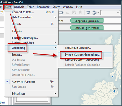
Minutes 1 and 2 – Add a csv file to your copy of Tableau desktop, this tells Tableau the Lat/Long of the outcodes

You’ll need a csv file of outcodes, so I have posted one here.  Copy this file and save it.

Add it to tableau LIKE THIS…  Choosing the csv file from your save location.

image


Minute 3 – Create a calculated field which grabs the outcode from the postcode.  The function for the calculated field is something like this:

left([Postcode], find([Postcode], " ")-1)

This finds the space in the postcode, and returns the left portion which is equivalent to the outcode in the csv file.

image


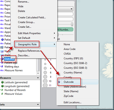
Minute 4 – Change the ‘geographic role’ of your calculated field to be outcode.  Outcode is now available as a geographic role because of the csv file added

image


Minute 5 – Now you should be able to plot the outcode against a measure.  Select the outcode field, select ‘number of records’ (for example) and show me should now offer you a map.  Hey pesto, postcode mapping!


image

Happy mapping.

Tom

Simple forecasting using Tableau


So your boss asks you for a forecast – data driven of course, and he wants it in five minutes.  When’s that project going to finish, how many staff are we going to employ in a years time, what will be the final cost of the office move program.

AND I expect your boss wants a chart showing the EXACT date, headcount, cost, whatever.  AND he wants it in five minutes.

Don’t panic.  Crank out Tableau, and your done.

Lets forecast headcount based on the numbers for the last 24 months or so…  we’re looking for a prediction of the next 12 months, and we have 5 minutes to get it done…

Here’s a sample of our data set:image

So, its simple enough to plot this out in Tableau, I’m simply going to cut and paste the data right in as its the fastest way…

The first visualisation of this data is simply the headcount plotted against the date, thus:

image


Nothing very interesting here right, and hardly a forecast.

But with a few simply changes, we can get some decent information.

Firstly, using the drop down from the date field, select ALL VALUES.

image

Remove all other dimensions from the column shelf:

image

And then add a trend line…

image

Now by changing the scale on the X axis, to extend the reach of the trend line, we can start to make simple data driven estimates of future headcount.  In my example, I had to edit the Y axis too, as the headcount was growing way past the current data set.  The result is as follows.

image

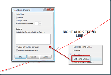
In order to reflect the increasing rate of change of headcount, I’ll edit the trend line as below.

image

This gives us the following chart, which is pretty close to the finished article:


image

But with a little formatting, and using point markers, we can polish the chart to look like this:

image

This example uses banded reference lines, point markers (which get a dynamic value by dragging the arrow end), and a line end marker to show the current headcount value.

Enjoy.

Tom

Technorati Tags: ,

Tuesday, 15 June 2010

Use cases for Yammer – how much email can it replace?


Can Yammer (or other enterprise microblogging tools) be used to replace some of the volume of email traffic sent within an organisation?

Why even try to do this?  Email is awesome.

I guess if you think email is awesome, then this isn’t for you.  But if, like I do, you share the opinion that private communication through email misses a HUGE opportunity to engage people, then read on!

Email is a CLOSED communication method.  You choose who should read your thoughts and send them then email.  This is the electronic equivalent of passing notes around at school.  Imagine just how many notes you would have to pass around to keep everyone in the loop.

Microblogging tools can be used to facilitate OPEN communication.  Questions and thoughts previously shared between small groups (unless you’re commonly using the dreaded ALL email) can now be seen by larger communities making connections previously unexplored.

There are other benefits of course:

  • More open communication may actually result in a need for LESS communication generally, the same message is being sent MANY times in the closed world of email
  • It may actually be faster to handle a stream of incoming yammers – they don’t need filing or deleting for example
  • They are faster to write – the informality means no need for subject, no formal signoff etc
  • You can choose what comes your way, by following individuals or subjects
  • There is an open, shared searchable record of communication

So how to use Yammer in this way?

There are so many use cases for Yammer, but I’ll stick to those which replace functionality normally reserved for email.  I’ll also detail how to read yammer as this approach could dramatically increase the amount of yammer activity.

USE CASE 1 – The ‘all’ email

This is an easy one.  Just post your thoughts to Yammer.  If you need to post an attachment which is only relevant to the message (such as a picture) then attach it to the yam.  Else, file the document on SharePoint (or similar) and include a link to the file.

Benefits?

  • You don’t end up with 100’s of emails which need to be processed by your staff.  Imagine it takes 30 seconds to decide what to do with an email.  That’s a lot of wasted time from your team.
  • You don’t clog up the email server
  • You’re creating a searchable repository of knowledge
USE CASE 2 – The simple email (not private)

Possibly the most common form of email – and the primary use case for Yammer.  A very simple request, to one or two people.  For example -

“Dave, have you got any experience with #Fuzzpot software, I need some notes for a proposal”

This is better handled as OPEN communication, and in Yammer this would be represented as:

@Dave - have you got any experience with #Fuzzpot software, I need some notes for a proposal”

This style of message will cause the message to be directed to Dave (by the use of the @ symbol) but will also display the message to anyone following the message author (and in the company feed)

Benefits?

  • There may be many others with experience in this software who would would have not been included in the email – hopefully they see the yam and jump right in with a response
  • Others who see this conversation happening may remember that the company now knows something about Fuzzpot software – this might come up again in a few months
  • A search for #Fuzzpot will now return this conversation, possibly revealing the company experts in the subject
  • Anyone following the #Fuzzpot hashtag will be notified that this conversation is happening immediately
USE CASE 3 – The simple PRIVATE email

Some communication should remain private (probably less than you think) – and of course this can be handled by Yammer.

TO:Dave What are you up to tonight?

Will send a private message to Dave which is not seen by others.

Benefits?

  • Adding communication to your ‘stream’ or ‘feed’ removes the need to file, delete etc which creates a lot of the email burden.
  • The obvious benefit of moving more and more communication to lighter tools which are faster to use


USE CASE 4 – The ‘Distribution List’ email

It’s very common to send an email to teams using distribution groups and of course, these groups can be replicated using Yammer.  You can then send to these groups using both the @ and the to: syntax.

Benefits?

  • Groups are managed by the people using them, not IT – so you can setup any groups immediately for any purpose
  • Email distribution groups provide an easy way to send loads of emails, so finding another way can significantly lighten the load on you email servers

How to read all this new content??

Imagine if everyone in your organisation started using Yammer in this way.  Wouldn’t you have thousands of messages flying around and no time to read it all.

This is easy to handle – Twitter has 100 million users and solves this problem – it can’t be hard within a company.

Firstly you have to accept that Yammer provides a stream of information, it is very conversational in fact.  In every conversation there will be things of interest, others less so – don’t panic if not everything is exactly relevant.

Try these approaches to get what you want…

I want it all.

Easy.  Go into the Yammer web application, follow the link to members and check the FOLLOW ALL box (top right).  Now your feed will contain all posts.  When this gets too much for you, try one of the other approaches.

I trust certain people and only want to hear their thoughts.

Don’t use follow all.  Select the individuals you are interested and follow them only.  You’ll still see messages which are directed at you via @ and to: but will not be overloaded with idle chatter.

I’m also in certain groups

Hey, you can follow groups too (if the group admin allows it)

And I’m interested in specific subjects

You can also follow tags.  For example, following #yammer will alert you when anyone mentions yammer (even someone you are not following)


That should do it for now!  I hope this helps shoulder some of your email burden!

Wednesday, 14 April 2010

What does the perfect ad-hoc reporting database look like?


So you have Tableau or another reporting tool which can read from a live database?  But your database has crazy field names, and loads of fields which are holding up your analysis.

What attributes does the perfect data source for Ad-hoc reporting have?

I came up with these – I’d love to know if you can think of more!

1. The data source should be well isolated in the database, so that users can find the correct data source immediately

2. There should be no requirement to create joins to other tables

3. The fields in the data set should be returned in an appropriate order – typically in order of importance, with some grouping determined by the purpose of the data

4. The field names should be semantically correct, using business terms and have a consistent naming convention

5. Fields should be of the correct type so they are interpreted correctly by the reporting tool (date, numbers strings etc)

6. The data source should be high performance (< 2 second response time)

7. Any geo spatial data should be at an appropriate level of zoom – particularly important for postcode data for example (outcode is most often appropriate, rather than the full postcode)

8. The data set should contain no ID fields, except for the primary entity in the data set (i.e. the list of properties SHOULD contain the PropertyID field, but no others)

9. The data set should have the minimum number of fields possible. It is better to handle requests for additional data items than to flood the data set with fields which are not used and confuse the end user)

10. Date fields should be complete dates, not part of dates like year or month.  A good ad-hoc reporting tool will handle this easily.

Enjoy!!  And please let mw know of any more!

Tom

Sunday, 21 February 2010

Analysing data from ACT! using Tableau


Analysing CRM data is a great use of Tableau, and ACT from Sage is one of the most commonly used CRM applications.  This posts hopes to explain how to get started analysing data from ACT! databases using Tableau.

This is a ‘getting started’ post!  I intend to explain how to analyse data from ACT! which has first been extracted into Excel, rather than by making a direct connection to the database.

STEP 1 – Choose an entity from ACT to analyse, and setup ACT appropriately

Lets start with ‘Opportunities’.  Go to the opportunities view image in ACT as shown here, and then right click the column headings.  Select ‘Customise Columns’.

In the dialog presented, select all the available fields and move them to the list box on the right.

This will allow extraction of all the fields into an EXCEL spreadsheet which can later be analysed using Tableau.


STEP 2 – Export the opportunity list from ACT! to EXCEL

imageExporting the data is as simple as right clicking anywhere on the grid, and selecting the appropriate function.


NOTE – The EXCEL file created by ACT! has two additional sheets which cause problems with Tableau and must be deleted, delete the ‘Opportunities Pivot Chart’ sheet, and ‘Opportunities Pivot’ sheets.

SAVE the EXECL sheet.

STEP 3 – Now we’re ready to analyse this data using Tableau!

This post is not intended to be a training course on Tableau however, there is another post here which should help.  But here are some simple steps to get started analysing opportunities from ACT!

PIPELINE DISTRIBUTION by ‘Stage’

  1. Connect to the spreadsheet using the ‘Connect to Data’ option
  2. Highlight ‘Total’ and ‘Stage’ in the data window to the left (use the Ctrl key to highlight them both
  3. Hit ‘Show Me’ and select ‘Aligned Bar’ as in the image below

image

4.   Swap the axis and rank the categories using the toolbar buttons in the image below

image

And there you have it, a ranked bar by sales stage of data from ACT!

What’s next?

This is obviously the first part of a longer story.  There are endless ways to rapidly analyse data using Tableau, and many other entities in ACT! which can be analysed.

In addition, the next stage is also to connect Tableau directly into the ACT! database to remove the need for the EXCEL step – this will be the focus of a post for another day!